Block Options
This page is to outline all blocks that are available to edit and build new pages from.
1 column – Content
This option uses:
- 1 column block
- Heading block, that uses a thin weight & H2 tag & styling
- Button
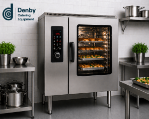
1 column – Image
1 column – Testimonials
“Lorem ipsum dolor sit amet, consetetur sadipscing elitr, sed diam nonumy eirmod tempor invidunt ut labore et dolore magna aliquyam erat, sed diam voluptua. At vero eos et accusam et justo duo dolores et ea rebum. Stet clita kasd”
Name of client
Business Name
“Lorem ipsum dolor sit amet, consetetur sadipscing elitr, sed diam nonumy eirmod tempor invidunt ut labore et dolore magna aliquyam erat, sed diam voluptua. At vero eos et accusam et justo duo dolores et ea rebum. Stet clita kasd”
Name of client
Business Name
1 column – Icon Block
Title
Text goes here
Title
Text goes here
Title
Text goes here
Title
Text goes here
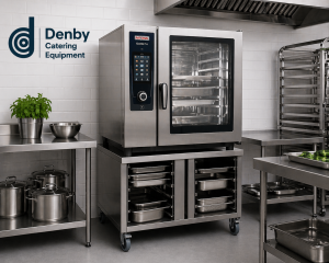
2 column – Content
This option uses:
- 2 column block
- Heading block, that uses a thin weight & H2 tag & styling
- Paragraph
- Button
- Image

Background Selection Block
Background selection shows as a blue background. You then select how many columns are needed.
Title
Add content here…
Title
Add content here…
Title
Add content here…
Title
Add content here…
Blocks that don’t need columns…
Product grid
Case studies
Accordion
CTA Block (Call to action)
Latest News
Tabs
FAQs


Case Studies
View our latest case studies here.

Accordion
Add introduction text here
Info goes here…
Info goes here…
Latest News
Add into text here…
Add information here
Add information here
Add information here
FAQs
Add answer
Add answer
Meet the Team
Add into here…
